
 Français
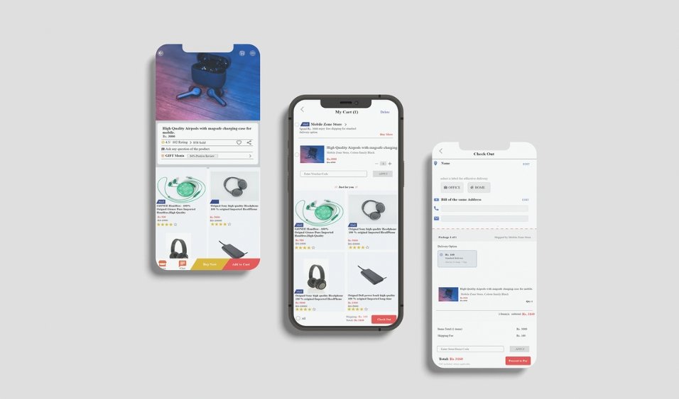
Introduction
With mobile device usage at an all-time high, mobile user experience (UX) has become a critical factor for business success. More people now access websites, apps, and digital content on their phones than ever before, making a mobile-friendly design essential for engagement and conversions.
At Eagle Click Media, we specialize in mobile-first digital marketing strategies to help businesses create seamless user experiences. This guide explores the best practices for mobile UX and how you can optimize your website or app for success in 2025.
Why Mobile UX Matters
A strong mobile UX ensures that users can navigate your website or app effortlessly, leading to:
- Higher engagement: Users stay longer and interact more.
- Better conversion rates: A seamless experience increases sales and sign-ups.
- Improved SEO rankings: Google prioritizes mobile-friendly websites in search results.
- Lower bounce rates: Poor UX frustrates users, causing them to leave quickly.
With over 65% of global web traffic coming from mobile devices, investing in a strong mobile UX strategy is no longer optional—it’s essential.
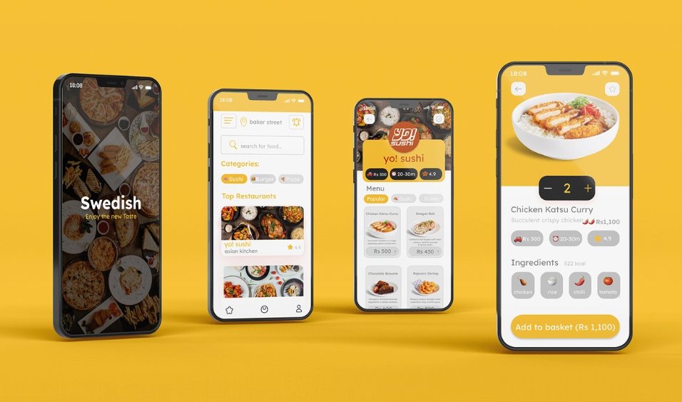
Key Mobile UX Design Principles
1. Optimizing for Smaller Screens
Since mobile screens are smaller than desktops, it’s crucial to:
- Prioritize key content: Display essential information upfront.
- Keep the design clean: Avoid clutter and distractions.
- Ensure readability: Use large fonts and high contrast for easy reading.
2. Creating Intuitive Navigation
Smooth navigation enhances user experience and keeps visitors engaged. Best practices include:
- Sticky navigation bars: Keep essential menus always accessible.
- Simple menus: Use collapsible sections instead of complex dropdowns.
- Search functionality: Help users find what they need quickly.
3. Designing for Mobile Interactions
Mobile users rely on touch gestures, so UX design should accommodate:
- Larger touch targets: Buttons should be easy to tap.
- Well-spaced elements: Prevent accidental clicks.
- Fast load times: Optimize images and minimize unnecessary code.
4. Adapting to User Context & Behavior
Mobile users often browse while on the go, so ensure:
- Quick access to key features (e.g., contact buttons, checkout).
- Optimization for different environments (e.g., dark mode, one-handed use).
- Fast page loads (users expect sites to load in under 3 seconds).

Best Practices for a Seamless Mobile UX
1. Mobile-First Design Approach
Design for mobile first, then scale up for desktop. This ensures a responsive and user-friendly experience.
2. Implement Responsive Web Design
Your website should adapt to all screen sizes, from smartphones to tablets, ensuring a consistent experience.
3. Improve Mobile Page Speed
Slow-loading pages drive users away. Improve speed by:
- Compressing images to reduce load times.
- Using a mobile-friendly hosting provider.
- Minimizing scripts and pop-ups.
4. Use Thumb-Friendly Design
Most users navigate with their thumbs, so:
- Place important buttons within easy reach.
- Avoid placing key features at screen edges.
5. Test and Optimize Continuously
Regular testing improves UX. Use:
- A/B testing to refine designs.
- Heatmaps to track user behavior.
- User feedback to identify issues.

Future Trends in Mobile UX for 2025
1. AI-Powered Personalization
AI will enable real-time customization, delivering tailored content based on user behavior.
2. Voice and Gesture Navigation
More users will rely on voice commands and gesture-based controls, reducing the need for typing.
3. Augmented Reality (AR) Experiences
Brands will integrate AR features for interactive shopping and immersive engagement.
4. Privacy-First UX Design
With rising data privacy concerns, businesses must ensure secure, transparent user experiences.
Conclusion
Optimizing mobile UX is essential for businesses looking to increase engagement, improve conversions, and stay ahead in 2025. By focusing on responsive design, fast performance, and user-friendly navigation, you can create a seamless mobile experience that keeps customers coming back.
At Eagle Click Media, we help businesses enhance their mobile UX to drive better results.
📞 Contact us today to optimize your mobile experience and boost your online success!
FAQs
1. Why is mobile UX important?
A good mobile UX ensures users can navigate your website easily, improving engagement, conversions, and SEO rankings.
2. What is the best way to improve mobile UX?
Focus on responsive design, fast load times, clear navigation, and thumb-friendly layouts.
3. How can I check if my website is mobile-friendly?
Use Google’s Mobile-Friendly Test or tools like PageSpeed Insights to analyze performance.
4. What trends will shape mobile UX in 2025?
AI personalization, voice navigation, augmented reality, and privacy-focused design will dominate.
5. How can Eagle Click Media help improve my mobile UX?
We offer custom mobile UX optimization strategies to enhance your website’s performance, engagement, and conversion rates.
By investing in better mobile UX, businesses can enhance user satisfaction, increase revenue, and strengthen their digital presence. Let Eagle Click Media help you stay ahead in 2025!


